For Alan I wanted to give him a more regal, almost formal look. I pictured him as the older mentor of the group, and wanted to reflect that in his costume. I kept the red and green from his original look but ditched the yellow and the crazy disco color in favor of black and a more armored-looking collar. I also loved how in the comic book "The Golden Age", they talked about Alan as this great powerhouse, so I hoped to convey some of that power here.
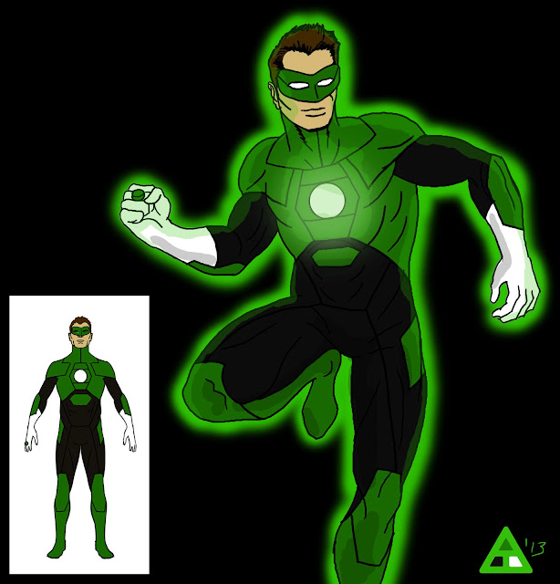
For Hal's look I stuck pretty close to his original design, but tweaked/simplified his lantern logo a little bit, and added some geometric shapes to break up the large areas of green. I originally wanted to put him in his Air Force jacket, but I didn't want it to cover up too much of his costume and skipped it.
For John's look, I wanted to reflect his history as an architect, so I gave him a black bodysuit with green lines reminiscent of blueprints. So, greenprints? I don't know. Anyway, I liked in Geoff Johns' run on Green Lantern how he described the different personalities of the various Green Lanterns and how it affected how they looked/what constructs they created. Kyle created monsters and abstract things, Hal created simple fists and hammers, and John created complex, detailed constructs. That always stuck with me as a cool concept.
While designing Kyle I wanted to keep his trademark mask, but other than that I figured as an artist he would try to streamline and simplify his costume. I always thought the large area of white on his chest looked pretty striking, so I went with that, turning it into an abstract representation of a lantern. I ditched the gauntlets and boots though- I thought they were too clunky.
And a line-up of their different costumes that I used while initially designing them:
Also, here's actually my first take on Hal, done fairly quickly right at the start. I at first pictured him as more of an astronaut, and gave him a streamlined space suit. I like it for its simplicity and sleekness, but went with the group take instead.
And here's some bonus prelim sketches:
Let me know what you think of my Green Lanterns!


